NEW PROJECT
MODERN RUSTIC RANCH
Welcome to Modern Rustic Ranch, our newest interior design project by Guided Home Design. Our goal for this home was to make it as cozy and comfortable as possible for our clients who are frequent travelers.
By incorporating a neutral palette with pops of rich brown, woven textures and boucle accents, we created the coziest, rustic home infused with a modern touch. Check out every room in this laid-back and inviting home, designed by Maddie Cullen, our Director of Interior Design, Lily Quintal, interior designer, and Madison Richie, design assistant.
THE KITCHEN
This kitchen was the perfect canvas for our interior designers. They added natural wood and stone elements in the accessories for a collected look. Our selection of diverse warm woods helped bring that rustic touch into the project, and we added a pop of black with the counter stools for a crisp contrast.


THE DINING AREA
This dining room perfectly embodies mixed textures and rustic wood. We styled our famous rattan sideboard featuring natural cane and woven textures to add dimension and depth to the space.
As table centerpieces, we incorporated textured white pots to tie into the canvas artwork and boucle dining chairs.
THE LIVING ROOM
For this open concept living room, our team ensured that the space flowed seamlessly with the dining and kitchen areas. We incorporated accessories on the coffee tables, console tables and the shelves to mimics the warm woods and decor utilized in the home.
We wanted this living room to feel rich and cozy, so we incorporated a high contrast rug and dimensional, plush pillows.
THE ENTRYWAY
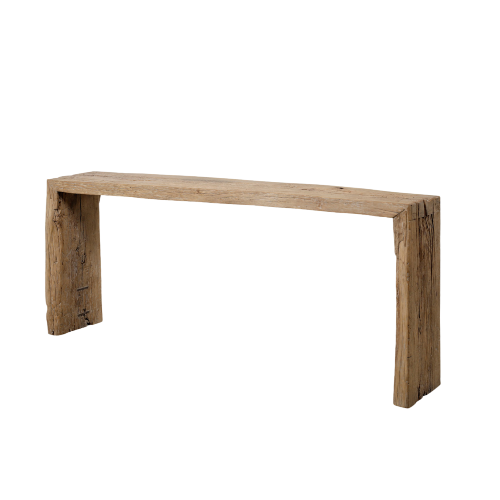
For this welcoming entryway, we brought in this wooden console table with a variety of neutral home decor and a textured round mirror.


THE PRIMARY BEDROOM
When designing the primary bedroom, we created two main focal points: the unique chandelier and the neutral gallery wall with different pieces of art that varied in style, size, and texture.
To add additional interest to this gorgeous primary bedroom, we included a neutral wallpaper designed to look like roman clay.


THE PRIMARY BATHROOM
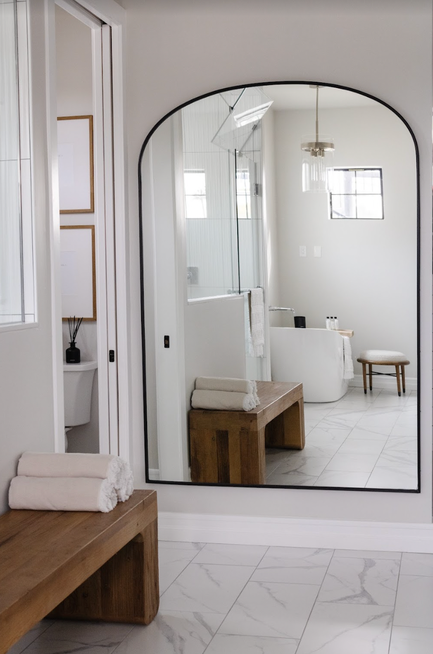
We added pops of wood to this primarily white bathroom sanctuary. The ottoman and bench were the perfect way to add functional seating and warm tones.


SPARE BEDROOM #1
Similar to the primary bedroom, our luxury interior designers utilized soft neutrals, cozy textures and textured wallpaper to give this bedroom a creamy, cloud-like feel.
SPARE BEDROOM #2
Differing from the last two rooms, our interior designers incorporated blacks and browns to the last bedroom to pop against the dark wood tones.


